

Introduction
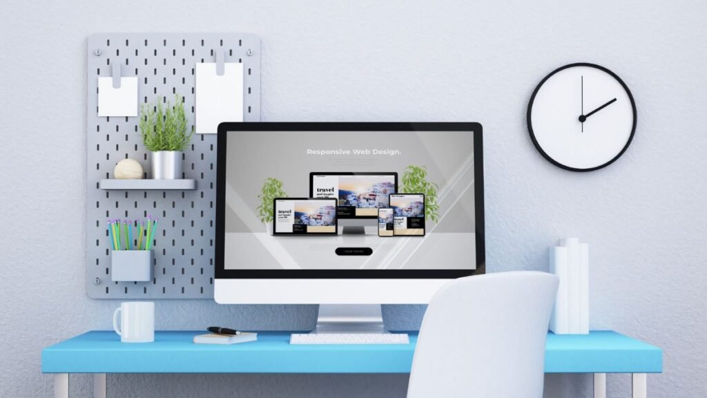
Imagine designing a beautiful website that looks perfect on a desktop monitor, only to discover it breaks awkwardly on tablets, appears cramped on smartphones, and becomes nearly unusable on foldable devices. This frustrating scenario plays out daily for designers and developers who rely heavily on fixed-pixel measurements.
Enter the concept of pxless design—a paradigm shift that challenges the traditional approach of defining every element in rigid pixel values. The term “pxless” represents a philosophy of reduced dependence on pixels, embracing fluid, adaptive layouts that respond naturally to any screen size or device configuration.
This comprehensive guide explores why pxless design has become essential for modern digital experiences. Readers will discover the core benefits of this approach, practical implementation strategies, common challenges to anticipate, and forward-looking insights into how this methodology shapes the future of web and application development.
The transition from pixel-perfect specifications to fluid systems isn’t merely a technical adjustment—it represents a fundamental rethinking of how digital interfaces should adapt to an increasingly diverse ecosystem of devices and user needs.
What Does “pxless” Mean?
Etymology and Core Definition
The term “pxless” combines “px” (the abbreviation for pixels in CSS) with “less,” creating a descriptor that means reduced reliance on fixed pixel measurements. This approach doesn’t advocate for eliminating pixels entirely—rather, it promotes moving away from hard-coded pixel values toward relative units and fluid layout systems.
Consider the difference between these two approaches:
Traditional pixel-based approach:
css
.container {
  width: 1200px;
  font-size: 16px;
  margin: 20px;
}
Pxless approach:
css
.container {
  width: 90%;
  max-width: 75rem;
  font-size: 1rem;
  margin: 1.25rem;
}
The second example uses percentage widths, rem units for typography, and relative spacing—all hallmarks of pxless methodology.
What Pxless Isn’t
Clarifying misconceptions proves important: pxless design doesn’t mean “never use pixels under any circumstances.” Certain scenarios still warrant pixel values—particularly for borders, small decorative elements, or brand-critical graphics where precision matters. The philosophy centers on avoiding fixed pixels for major layout structures, typography scales, and spacing systems.
The Shifting Design Ecosystem
The relevance of pxless design emerges directly from technological evolution. A decade ago, designers could reasonably target a handful of standard screen resolutions. Today’s landscape presents exponentially greater complexity:
- Smartphones ranging from compact 5-inch screens to massive 7-inch phablets
- Tablets in multiple aspect ratios and orientations
- Desktop monitors from standard HD to ultra-wide 5K displays
- Foldable devices that transition between phone and tablet configurations
- High-DPI “retina” screens that pack more pixels per inch
- Smart TVs, wearables, and emerging form factors
Each device category introduces unique viewport dimensions, pixel densities, and interaction patterns. Fixed-pixel layouts simply cannot accommodate this diversity without creating dozens of specific breakpoints—an unsustainable maintenance burden.
Why “pxless” Matters Today
The Diverse Device Landscape
Modern users access digital content across an astounding variety of devices. According to industry research, website traffic now comes from hundreds of distinct device models, with new configurations appearing monthly. Foldable smartphones alone introduce dynamic viewports that can shift mid-session as users unfold their devices.
Traditional fixed-width designs force these varied devices into awkward compromises—either displaying tiny, unreadable text or triggering horizontal scrolling that frustrates users. Pxless approaches handle this diversity gracefully by scaling proportionally rather than breaking at predetermined thresholds.
Accessibility and User Empowerment
Accessibility considerations elevate pxless design from technical preference to ethical imperative. Users with visual impairments often adjust their browser’s default font size or use zoom features to make content readable. Fixed-pixel layouts frequently break under these conditions, causing text to overflow containers or navigation elements to overlap.
Relative units respect user preferences automatically. When someone increases their browser’s base font size from 16px to 20px, designs built with rem units scale proportionally, maintaining intended hierarchies and spacing relationships. This adaptive behavior benefits everyone—not just users with disabilities, but also older adults, people using devices in bright sunlight, or anyone who simply prefers larger text.
Performance and Maintenance Advantages
Managing multiple fixed breakpoints creates significant overhead. Each breakpoint requires testing, debugging, and ongoing maintenance. As new devices emerge, teams must continuously add more breakpoints, expanding CSS files and increasing complexity.
Fluid designs reduce this burden dramatically. A well-architected pxless system might require only two or three strategic breakpoints instead of eight or ten device-specific ones. This simplification accelerates development, reduces bug surfaces, and makes codebases more maintainable over time.
SEO and User Experience Benefits
Search engines have evolved to prioritize mobile-friendly, responsive designs. Google’s mobile-first indexing means the search giant primarily evaluates the mobile version of websites for ranking purposes. Adaptive, fluid layouts signal quality and user-centricity—factors that indirectly boost search visibility.
Beyond algorithmic considerations, user experience metrics directly impact rankings. Visitors who encounter broken layouts, unreadable text, or awkward navigation quickly abandon sites, increasing bounce rates and decreasing engagement time. These behavioral signals tell search engines that content fails to satisfy user intent, potentially lowering rankings.
Future-Proofing Digital Properties
Perhaps the most compelling argument for pxless design involves preparing for unknown futures. Five years ago, few designers anticipated foldable smartphones or ultra-wide gaming monitors. Ten years from now, new form factors will emerge that nobody currently imagines.
Fluid, relative-unit-based designs adapt to novel devices without requiring redesigns. This future-proofing quality protects long-term investments in digital properties, ensuring they remain functional and attractive regardless of technological evolution.
Key Principles of pxless Design
Embracing Relative Units
The foundation of pxless design rests on relative measurement units that scale proportionally rather than remaining fixed:
rem (root em): Based on the root element’s font size, typically 16px by default. One rem equals the root font size, making it perfect for creating proportional spacing and typography scales. Unlike em units, rem values don’t compound when nested.
em: Relative to the parent element’s font size. Useful for spacing within components that should scale with their local typography.
Percentages (%): Relative to the parent container’s dimensions. Ideal for fluid widths and flexible layouts that adapt to various screen sizes.
Viewport units (vw, vh): Proportional to the viewport width or height. One vw equals 1% of viewport width, making these units powerful for full-screen layouts and fluid typography.
If You Want To Read About Other Technology Articles Then Click Here
Fluid Grid and Layout Systems
Modern CSS provides robust tools for creating adaptive layouts without fixed dimensions:
CSS Grid with fractional units (fr): The fr unit divides available space proportionally, enabling truly flexible grids that adjust to container sizes automatically.
css
.grid-container {
  display: grid;
  grid-template-columns: repeat(auto-fit, minmax(15rem, 1fr));
  gap: 1.5rem;
}
Flexbox: Perfect for one-dimensional layouts that need to distribute space flexibly among items.
Min-max functions: Allow setting boundaries while maintaining fluidity between those limits, preventing layouts from becoming too cramped or excessively spacious.
Scalable Typography and Spacing
Typography deserves special attention in pxless systems. Establishing a modular scale using relative units ensures consistent visual hierarchy across all devices:
css
:root {
  --font-size-base: 1rem;
  --font-size-lg: 1.25rem;
  --font-size-xl: 1.5rem;
  --font-size-2xl: 2rem;
  --font-size-3xl: 3rem;
}
Spacing systems follow similar principles, using a consistent scale (often based on multiples of 4 or 8) implemented with rem units:
css
:root {
  --space-xs: 0.25rem;
  --space-sm: 0.5rem;
  --space-md: 1rem;
  --space-lg: 1.5rem;
  --space-xl: 2rem;
  --space-2xl: 3rem;
}
Mobile-First Progressive Enhancement
Starting designs with mobile constraints forces prioritization of essential content and functionality. As viewport size increases, progressive enhancement adds sophistication without compromising the core experience.
This approach naturally leads to pxless thinking because mobile designs inherently require flexibility to accommodate the wide range of small-screen devices.
Design Tokens and Component Systems
Modern design systems centralize styling decisions into reusable tokens—variables that define colors, spacing, typography, and other properties. When these tokens use relative units, every component built from them automatically gains pxless characteristics.
Component-based architectures amplify this benefit. A button component designed with relative padding and rem-based font sizes will scale appropriately regardless of where it appears or what device renders it.
Accessibility and Inclusive Design Principles
Pxless design inherently supports accessibility by respecting user preferences and assistive technologies. Avoiding fixed pixel traps—scenarios where content becomes unreachable or unusable when users adjust settings—ensures digital properties serve the broadest possible audience.
pxless vs Traditional Pixel-Based Design: A Comparison
AspectTraditional Pixel-BasedPxless DesignPrecision & ControlHigh control over exact placement and sizingIntentional flexibility; control through constraints rather than fixed valuesPredictabilityConsistent appearance across similar devicesAdaptive appearance that responds to contextMaintenance BurdenHigh; requires multiple breakpoints and device-specific rulesLower; fewer breakpoints and self-adapting componentsFlexibilityLimited; requires manual adjustments for new devicesHigh; automatically accommodates new form factorsAccessibilityOften breaks with font-size adjustments or zoomNaturally responsive to user preferencesPerformanceCan be more performant with simpler calculationsMinimal performance impact with modern browsersDevelopment SpeedSlower due to device-specific testing and fixesFaster once system is establishedUser ExperienceMay break or feel awkward on unexpected devicesConsistently appropriate across devices
When Fixed Pixels Still Make Sense
Despite the advantages of pxless approaches, certain scenarios still warrant pixel-precise specifications:
Pixel art and specialized graphics: When the medium itself depends on exact pixel placement, fixed measurements remain necessary.
Brand-critical visual elements: Logos or specific brand elements sometimes require precise sizing to maintain identity guidelines.
Legacy system constraints: Older platforms or frameworks might not fully support modern relative units, necessitating pixel-based workarounds.
Border widths and small decorative elements: One or two-pixel borders and subtle visual separators typically use fixed pixels without causing responsive issues.
Hybrid Approaches
Many successful implementations combine both methodologies strategically. Major layout structures, typography, and spacing use relative units, while specific decorative elements or legacy components maintain pixel values. This pragmatic approach delivers pxless benefits without requiring complete system overhauls.
How to Implement pxless: Techniques & Best Practices
Conducting a Design Audit
Begin implementation by auditing existing designs to identify where fixed pixel values dominate. Review stylesheets for hard-coded px declarations in:
- Container widths and heights
- Font sizes and line heights
- Margins and padding
- Media query breakpoints
This inventory reveals conversion priorities and helps estimate implementation scope.
Establishing Root Font Size and Typography Scale
Set a sensible root font size, typically leaving it at the browser default of 16px (which equals 1rem). Build a typography scale using rem units:
css
html {
  font-size: 100%; /* Respects user preferences */
}

body {
  font-size: 1rem;
  line-height: 1.6;
}

h1 { font-size: 2.5rem; }
h2 { font-size: 2rem; }
h3 { font-size: 1.75rem; }
h4 { font-size: 1.5rem; }
h5 { font-size: 1.25rem; }
h6 { font-size: 1rem; }
Creating Fluid Containers
Replace fixed-width containers with fluid alternatives:
css
.container {
  width: 90%;
  max-width: 75rem;
  margin-inline: auto;
}
This approach ensures content spans most of the viewport while preventing excessively wide text lines on large screens.
Strategic Use of Viewport Units
Viewport units excel for certain scenarios:
Fluid typography:
css
h1 {
  font-size: clamp(2rem, 5vw, 4rem);
}
Full-height sections:
css
.hero {
  min-height: 100vh;
}
However, use viewport units judiciously, as they can cause unexpected behavior with mobile browser chrome appearing and disappearing.
Leveraging Modern CSS Layout
CSS Grid and Flexbox provide powerful tools for fluid layouts:
css
.card-grid {
  display: grid;
  grid-template-columns: repeat(auto-fill, minmax(20rem, 1fr));
  gap: 2rem;
}
This creates a responsive grid that automatically adjusts column count based on available space.
Building a Modular Spacing System
Establish consistent spacing using a scale of rem values:
css
:root {
  --space-unit: 0.25rem;
  --space-xs: calc(var(--space-unit) * 2);
  --space-sm: calc(var(--space-unit) * 4);
  --space-md: calc(var(--space-unit) * 6);
  --space-lg: calc(var(--space-unit) * 8);
  --space-xl: calc(var(--space-unit) * 12);
}
Smarter Breakpoints
Rather than creating breakpoints for specific devices, establish them based on where content naturally needs to reflow:
css
/* Small devices */
@media (min-width: 36rem) { }

/* Medium devices */
@media (min-width: 48rem) { }

/* Large devices */
@media (min-width: 62rem) { }

/* Extra large devices */
@media (min-width: 75rem) { }
Using rem-based breakpoints respects user font-size preferences even in media queries.
Component Libraries and Design Systems
Build component libraries with pxless principles baked in. Each component should use relative units internally and accept props or CSS custom properties for customization:
css
.button {
  padding: 0.75em 1.5em;
  font-size: 1rem;
  border-radius: 0.25em;
}

.button--large {
  font-size: 1.25rem;
}
Notice how the large variant only changes font-size—the padding and border-radius scale automatically because they use em units.
Comprehensive Testing Strategy
Test implementations across:
- Multiple physical devices (phones, tablets, desktops)
- Different browsers (Chrome, Firefox, Safari, Edge)
- Various zoom levels (100%, 150%, 200%)
- Adjusted font-size settings in browser preferences
- Both portrait and landscape orientations
- Foldable device simulators or actual foldable hardware
Tools and Workflow Integration
Modern design tools support responsive workflows:
Figma: Use constraints, auto-layout, and component variants to create designs that communicate fluid behavior.
Sketch: Leverage responsive resize and symbol overrides for adaptive components.
Browser DevTools: Use responsive design mode to test multiple viewports quickly.
Accessibility testing tools: Automated scanners like axe DevTools help identify accessibility issues related to fixed sizing.
Challenges & Pitfalls of Adopting pxless
Mindset Shift Requirements
Designers and developers trained in pixel-perfect workflows often struggle initially with pxless thinking. The transition requires embracing uncertainty and designing for ranges of possibilities rather than specific states.
Teams must learn to think in systems and constraints rather than absolute specifications. This cultural shift takes time and patience.
Browser and Feature Compatibility
While modern browsers offer excellent support for relative units and contemporary CSS features, some older browsers present challenges:
- Internet Explorer lacks support for CSS Grid and some newer viewport units
- Container queries, though recently standardized, aren’t universally supported yet
- Certain CSS functions (like clamp) require fallbacks for older browsers
Progressive enhancement strategies help mitigate these issues, providing simpler fallback experiences while delivering enhanced functionality to modern browsers.
Performance Considerations
Excessive use of complex calculations occasionally impacts performance. Browsers must recalculate layouts when viewport units change during scrolling (on mobile) or resizing. This can cause reflows and layout thrashing if overused.
Best practices include:
- Using CSS custom properties to minimize recalculation
- Avoiding viewport units for properties that change frequently
- Testing performance with browser profiling tools
- Optimizing animations and transitions separately from layout
Maintaining Visual Consistency
Fluid layouts introduce variability that can lead to unintended visual drift—elements that align perfectly at one viewport width may misalign slightly at others. Careful attention to spacing scales and consistent use of grid systems helps prevent these issues.
Managing Stakeholder Expectations
Clients and stakeholders often expect designs that “look exactly like the mockup” across all devices. Educating them about the benefits of fluid behavior and demonstrating responsive previews helps manage expectations.
Consider creating interactive prototypes that show how designs adapt across viewports, making the fluid behavior tangible and understandable.
Testing Complexity
The nearly infinite combination of devices, orientations, zoom levels, and user settings makes exhaustive testing impractical. Establish risk-based testing strategies that prioritize the most common configurations while spot-checking edge cases.
Fallback Strategies
Sometimes fixed pixels serve as necessary fallbacks. When progressive enhancement requires simpler experiences for older browsers, strategically placed pixel values provide baseline functionality while modern browsers receive fluid enhancements.
pxless in Practice: Real-World Use Cases & Industry Applications
Web Design and Development
Modern websites increasingly adopt pxless methodologies to serve global audiences across countless devices. News sites, corporate websites, and marketing pages benefit from layouts that adapt seamlessly from phones to desktop monitors.
Example scenario: An editorial website implements fluid typography using clamp() functions, ensuring headlines remain proportionally sized across all viewports. Content containers use percentage widths with max-width constraints, creating comfortable reading experiences on any device.
Mobile Applications
Native mobile apps and progressive web apps benefit from pxless thinking when designing for the fragmented Android ecosystem or accommodating both iPhone SE screens and iPad Pro displays.
Example scenario: A productivity app uses relative spacing and scalable components, allowing the interface to adapt gracefully as users rotate their devices or run the app on tablets versus phones.
E-Commerce Platforms
Online stores must serve customers on every device imaginable. Product grids, checkout forms, and navigation systems all benefit from fluid designs that prioritize usability across contexts.
Example scenario: A fashion retailer implements a product grid using CSS Grid with auto-fit and minmax functions. The grid automatically adjusts column count based on available space, showing two columns on small phones, three on larger phones, four on tablets, and five or six on desktops—all without device-specific breakpoints.
Digital Branding and Marketing
Brand guidelines increasingly specify responsive behavior for logos, typography lockups, and visual identity elements. Pxless principles ensure brand consistency while allowing necessary adaptation across contexts.
Example scenario: A brand’s primary wordmark uses viewport-based sizing with minimum and maximum constraints, ensuring it remains prominent on small screens without overwhelming large displays.
Accessibility and Inclusive Design
Organizations committed to accessibility find pxless design essential for serving users with diverse needs and preferences.
Example scenario: An educational platform builds all components using rem-based sizing and relative spacing. When users with low vision increase their browser’s default font size, the entire interface scales proportionally, maintaining usability while accommodating their needs.
Case Study: News Publisher Redesign
A major news publisher noticed mobile bounce rates of 45% due to poor responsive behavior on older fixed-width designs. They implemented a pxless redesign using:
- Fluid typography with clamp() functions
- Grid-based article layouts using fr units
- Rem-based spacing throughout
- Strategic breakpoints based on content needs
Results after three months:
- Mobile bounce rate decreased to 28%
- Average session duration increased by 40%
- Page load times improved by 15% due to simplified CSS
- Maintenance time for responsive issues dropped by 60%
The Future of pxless: Trends & What’s Next
CSS Evolution
The CSS specification continues evolving with features that enhance pxless capabilities:
Container queries: Allow components to adapt based on their container’s size rather than viewport width, enabling truly modular responsive components.
Enhanced viewport units: New units like svh (small viewport height) and lvh (large viewport height) address mobile browser chrome issues.
Subgrid: Enables nested grids to align with parent grid tracks, improving consistency in complex layouts.
Safe area support: CSS environment variables help designs respect device notches and rounded corners.
Tooling Advances
Design and development tools increasingly support fluid workflows:
- Design systems as code platforms automatically generate responsive components from design tokens
- Visual regression testing tools specifically handle fluid layouts across viewport ranges
- AI-assisted design tools suggest responsive breakpoints based on content analysis
Device Evolution
Emerging form factors will further validate pxless approaches:
- Foldable devices with dynamic viewports
- Wearables with tiny, high-density screens
- AR glasses with spatial interfaces
- Vehicle displays with unique aspect ratios
- Smart home devices with varied screen sizes
Each new category reinforces the impossibility of fixed-pixel approaches and the necessity of fluid systems.
Automation and Design Systems
The future points toward increased automation in responsive design:
- Design tokens maintained in version control
- CI/CD pipelines that test fluid behavior automatically
- Component libraries that generate optimal responsive behavior
- Machine learning systems that suggest layout improvements based on user behavior data
Industry Predictions
Within five years, several trends seem likely:
- Fluid, relative-unit-based design becomes the default approach taught in design programs
- “Pixel-perfect” design becomes a niche specialty for specific use cases
- Design tools offer constraint-based systems as primary interfaces
- Responsive behavior becomes as important as visual aesthetics in design critique
- Accessibility through fluid design moves from nice-to-have to legal requirement
SEO, Performance & Maintenance Implications of pxless
SEO Benefits
Search engines reward sites that deliver excellent user experiences across devices. Pxless design contributes to SEO through:
Mobile-first indexing: Google primarily evaluates mobile versions of sites. Fluid designs ensure mobile experiences meet quality standards.
Core Web Vitals: Responsive layouts that avoid layout shift and load efficiently contribute to positive Cumulative Layout Shift (CLS) and Largest Contentful Paint (LCP) scores.
Reduced bounce rates: When visitors encounter functional, attractive designs on their devices, they stay longer and engage more deeply—signals that search engines interpret as quality indicators.
Accessibility correlation: Many SEO best practices align with accessibility improvements enabled by pxless design, creating compound benefits.
Performance Advantages
Pxless approaches often improve performance:
Simplified CSS: Fewer device-specific rules mean smaller stylesheet files that download and parse faster.
Reduced image variants: Fluid layouts often eliminate the need for multiple versions of the same image optimized for different breakpoints.
Efficient rendering: Modern CSS layout engines handle relative units efficiently, and fewer breakpoints mean fewer style recalculations.
Progressive enhancement: Building from mobile-first fluid foundations naturally leads to performance-conscious design decisions.
Maintenance Benefits
The long-term maintenance advantages of pxless systems prove substantial:
Single codebase: One layout system serves all devices, eliminating duplicate code for different breakpoints.
Faster updates: Changes propagate automatically across viewports without device-specific testing and fixes.
Lower bug surface: Fewer lines of code and simpler logic mean fewer places for bugs to hide.
Easier onboarding: New team members grasp systematic, token-based designs more quickly than complex pixel-specific implementations.
Future-proof architecture: New devices work automatically without requiring redesigns or extensive testing.
Monitoring and Optimization
Track the impact of pxless implementations through:
Analytics metrics:
- Bounce rate by device category
- Average session duration across viewports
- Conversion rates on different devices
- Exit rates on specific pages
Performance monitoring:
- Core Web Vitals scores
- Page load times by connection speed
- Layout shift metrics
- Paint timing measurements
User feedback:
- Accessibility testing with real users
- Usability studies across devices
- Support tickets related to display issues
Actionable Checklist for Teams
For Designers:
- Establish design tokens using relative units
- Create components that communicate fluid behavior
- Design at multiple viewport sizes simultaneously
- Document responsive behavior in specifications
- Test designs with adjusted browser font sizes
For Developers:
- Audit existing code for fixed pixel values
- Implement consistent spacing and typography scales
- Use CSS Grid and Flexbox with relative units
- Set up rem-based breakpoints
- Test across devices, zoom levels, and user settings
- Document fluid behavior in component libraries
For Marketers:
- Monitor mobile performance metrics
- Track engagement across device categories
- Ensure tracking scripts don’t interfere with fluid layouts
- Communicate responsive benefits to stakeholders
- Highlight accessibility improvements in reporting
Conclusion
The pxless design philosophy represents more than a technical implementation detail—it embodies a fundamental shift in how digital experiences adapt to human needs and technological diversity. By moving away from fixed pixel values toward fluid, relative measurements, designers and developers create interfaces that gracefully accommodate any device, respect user preferences, and remain functional as new form factors emerge.
The journey toward pxless thinking requires overcoming established habits and embracing uncertainty, but the rewards justify the effort. Improved accessibility ensures digital properties serve broader audiences. Enhanced performance and simplified maintenance reduce long-term costs. Better user experiences across devices drive engagement and conversions. Future-proofed architectures protect investments against technological change.
Implementation begins with small steps: auditing existing designs for fixed-pixel dependencies, establishing token-based systems using relative units, building component libraries that embody pxless principles, and gradually migrating legacy code toward fluid architectures.
The device landscape will only grow more diverse. Screen sizes, pixel densities, interaction patterns, and form factors will continue evolving in unpredictable directions. In this context, pxless design isn’t merely a trend or best practice—it represents competitive advantage for organizations that embrace it and technical debt for those who don’t.
Teams that invest in pxless methodologies now position themselves to deliver superior experiences consistently, regardless of what devices tomorrow brings. The question isn’t whether to adopt these principles, but how quickly organizations can make the transition.
Start today. Audit one component. Convert one stylesheet. Test with adjusted font sizes. Each small step toward pxless design brings digital properties closer to truly universal, accessible, human-centered experiences.


